Mobile Friendly Doesn’t = Mobile
It’s a common misconception that the good strategies employed on a traditional website naturally make the transition over to a mobile environment. As convenient as that would be, it’s just not the case.
The first step in understanding the differences in strategy between the two is to understand the difference between a mobile website and a
“mobile friendly” website.
“Mobile Friendly” websites on the other hand, utilize traditional web design, but are developed in such a way that they will display accurately on a mobile device. In this way, the website will work on a mobile device, but because of the difference in the size of the display area, the user must manipulate the site to find the information they seek.
Because of this difference in display size, and the poor user experience it can create, a best practice is to account for the mobile user while design your website. This specialized mobile interface is customized to the smaller display areas of mobile devices and is automatically loaded when a user visits your site via a mobile device.
In order to make maximum the use of the smaller display area, while ensuring the smoothest user experience, you should streamline the immediately available information within the mobile design. This is probably done shortening the navigation of the site.
Another difference between a traditional website made to be ‘mobile friendly’ and a truly mobile website, is the bandwidth, and subsequent load times, of a mobile device. With this consideration in mind, you should also look to limit the size and quality of the images you select. Smaller, less high resolution images load faster and, due to the smaller overall display, look no different than their traditional (full high resolution coupled with large display area) counterparts.
Combine all three of these techniques and you’ll have a good looking, fast loading, and easy to navigate version of your website that caters to the mobile user. This leads to a positive user experience and an increased awareness of your company and your products or services.
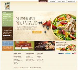
Let’s take a quick look at Panera Bread as an example. The first photo below is of their traditional website. Large high resolution images highlight a full featured website with a full navigation system. This works splendidly in a traditional desktop environment where a high speed connection
and full display is readily available.

This second photo from Panera Bread is of their mobile website interface. As you can see, they shortened the navigation system and made use of smaller images. This causes the site to load faster, while presenting users with specific information that a mobile user might be looking for. The end result is a great case study on understanding the differences between traditional and mobile environments.


