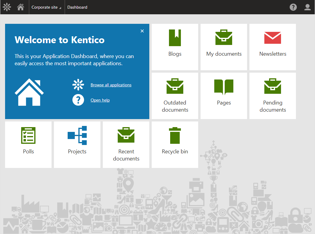
The New Kentico 8 Interface Design Will Impress
There is much anticipation around the upcoming release of Kentico 8 and the features provided in this content management system (CMS). Across the board, websites are changing dramatically and no longer can a successful website just be a brochure. Instead, websites are the focal point of any sales and marketing process and play a critical role in moving a client or prospect through the sales funnel.
Over the years, Kentico has added new features to the CMS which has made the application a bit difficult to navigate through. Simply put, things weren’t very intuitive. As a partner of Kentico we heard this at times from our clients which allowed us to create a training plan devoted just to the interface itself. Well designed user experiences should not require training on how to navigate through the application. Instead, well designed software should allow the user to easily navigate themselves through the application. Kentico knows this and has taken action. Going forward, instead of adding new features to the next Kentico release a wise decision was made to devote over three months entirely to the redesign of Kentico user interface.
Simple is Better
We’ve received several sneak previews of Kentico 8 and we are certainly impressed with the new design. Eventually, when Kentico 8 is released the user base will be pleasantly surprised (after getting over their initial shock) because it’s dramatic difference. Kentico has clearly put a focus on navigating the user through a path that will make better sense to the user instead of presenting them with a plethora of options. This simplified navigation will allow users to go to areas they intended instead of being somewhere only to realize they are in the wrong area.
Despite the dramatic change in the design users will immediately see the simple approach Kentico took with the user interface. No longer will the user interface be loaded with controls and buttons. Sometimes when you give users everything it becomes harder to use. Therefore, Kentico is improving the design by simplifying the availability of features so they coincide with the user, their role and where they are in the application.
The User has Expectations
The previous versions of Kentico did not necessarily behave how you might expect a web application to behave. For example, there were areas of the application where the browser back button would take the user somewhere other than back or the help section was not easy to locate. Users have general expectations on how a web application is supposed to function and when it doesn’t there becomes mistrust. Going forward, Kentico 8 will meet the expectations of users by providing them a trusted experience and an application that functions the way users expect it to function.
We are getting very excited for the official release of Kentico 8. The user interface has simply blown us away and we are anxious for our clients to experience what we’ve been able to. Kentico is passionate about their content management system and the digital marketing solutions it can provide. Going forward, the new design of Kentico 8 will allow users to fully maximize their investment.
Images are a courtesy of:
http://www.mcbeev.com/Blog/January-2014/8-Updates-Coming-in-Kentico-EMS-8
https://devnet.kentico.com/articles/new-application-structure-of-kentico-8


