Design Planning With Content Management Systems
“We need to be able to update the website ourselves”. Does this sound like a familiar phrase? It’s all too familiar to us here at Galvin. All clients we work with, whether they need a small 10-page site or a large database driven 100+ page site, want to be able to control content themselves.
Even though we now have easy ways for websites to keep changing, the strategy and design that goes prior to the implementation of the CMS is actually quite an involved process. This process takes a team of talented web strategists, designers and developers to accomplish it. There is a substantial amount of work that goes into creating a website that looks good, functions well and speaks to your users. It’s up to both the web development firm and the client to devise content strategy documents, site maps and design guidelines to keep sites well maintained.
The Importance of Design Planning
I wrote a blog post a while back entitled “There’s No Place Like Content Design“. It discusses how using tools in our CMS can help keep your content design consistent and to deliver content effectively to your users. Everything in that article remains important but what it doesn’t address is how important the initial User Experience and Brand Strategy are and how a CMS fit’s into these.
When we first begin brainstorming for a site there is always a deliberation of how “editable” the site needs to be. Do all areas of the homepage need to be editable or do only certain parts need to be? How many main navigation items will there be? Do we have to account for space if there are more items added down the line? All of these decisions come down to one idea; the more editable the site is the more restrictive the design will be.
Here are two extreme examples :
Example 1: The Extremely Creative & Immersive Site
http://unfold.no
This site is very creative and has a great brand experience. However, what will happen to the design if I add another person to their “We Are” section? The design will probably break because there isn’t enough room in the background area. What happens if I want to change a background photo? The photo could be too light or too dark in areas and the user won’t be able to see the content scrolling on top of it.
Example 2. The Standard CMS Solution Site
http://www.givingusareports.org
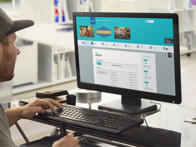
This site also has a great design that displays brand awareness. The difference between this and the prior example is that on this site every page has the same layout and doesn’t have as many effects or animations. This website was designed to make everything but the header and the footer editable. All other aspects of the site can be changed by the client: the homepage rotating feature, news feature, testimonials, events, etc.
Both of the these examples have a good user experience. The difference is that with Example 2 there are limitations of what the end result can be. Designers have to plan for any number of possible outcomes because they don’t know how the content will change in the future. Therefore, the design will always be more restrictive.
The Right Direction for Your Site
There’s no wrong answer here. It comes down to strategy. How important is it for you to be able to update the entire site? Is it better for the user experience and your brand to have a more interactive and creative site and only have a few parts updatable? Or do you have multiple products and internal changes that the website needs to reflect at a moments notice? If there is a strong initial content and user experience strategy in place, the direction should come naturally.

