The One-Page Wonders Seem to be a Hit for UX and Budget
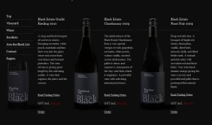
Not every website needs a lot of complexities tied to it but rather just a great design that gets to the point. Below are five examples of one-pagers that use anchor links to navigate the user throughout the page. By utilizing this concept you could focus a higher percentage of the budget to go to a very creative design because there really are not many complexities in the back-end. Although, I did like the Black Estate Vineyard and how they incorporated their eCommerce as an overlay. This obviously is a bit more complex due to the eCommerce functionality but it is still a good example of an one-page wonder. Plus, these one-pagers make it easier for the websites with smaller budgets to be very creative and successful.
Dan Tobolic
Sofa


