Successful E-commerce Design: Simplicity, Consistency & Hierarchy
Solid User Interface Design is important for any website to be successful. When you add the functionality of E-commerce it becomes increasingly more important. This is because you are asking your users to trust your brand and the security of a completely digital experience.
Simplistic Headers & Functional Footers
Headers are mainly for branding and navigation. Putting too much content into them can force confusion and make the entire site less usable. Users want quick access to key areas of your entire site, so keep the header simple and only include necessary elements. Layout, sizing and overall contrast is key to making this important area of your site usable. A simplified header also keeps the rest of the content on the page the important.
Footers are great places for contact and support information, store locations, social media links, newsletter sign ups and more. These secondary types of information that are important to users can be on every page, but not overpower the header or the rest of the page. Users are used to looking in this area for this type of information.
1. Lululemon.com
Header
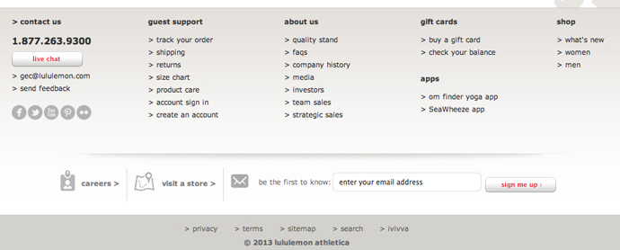
Footer
Why it works:
1. Keeps header clean by using drop downs to group content together.
2. Help, location and account information are easily found as there is ample negative space for your eye to move around.
3. Shopping bag and checkout are also easily found with unique style and sound hierarchy.
4. Footer content is grouped together well and important contact information is clearly repeated.
2. Skinnyties.com
Header
Footer
Why it works:
1. Shows a clean way of presenting special offers that don’t detract from the main navigation or cart area.
2. Header is kept simple by putting all contact info in the footer.
3. Contact info draws your attention so it’s easily found.
4. There is an overall sense of simplicity in both areas. Nothing is in the header or footer that doesn’t need to be there.
3. jenis.com
Header
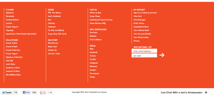
Footer
Why it works:
1. Branding is easily found in the header and again content is grouped to give a clean and simple approach.
2. Story and location was more important to this brand so they opted to put those items in the main nav, but were able to because they kept the main sections to only three (flavors, collections and goods)
3. Footer was chosen to be very functional, but still simple in its visual delivery. Lots of links and functionality are clearly defined with typography and simple design details.
Enticing Landing / Product Summary Pages
Landing pages are where you make your products shine. Users want lots of large images and key details before they are ready to make a purchase. The strategy for these pages doesn’t have to be super complicated, they just have to be useful and easy to digest. As with all aspects of a site, consistency is key here as well. Keeping product summary pages simple and clean will make the user want to know more and click through to buy.
1. Coach.com
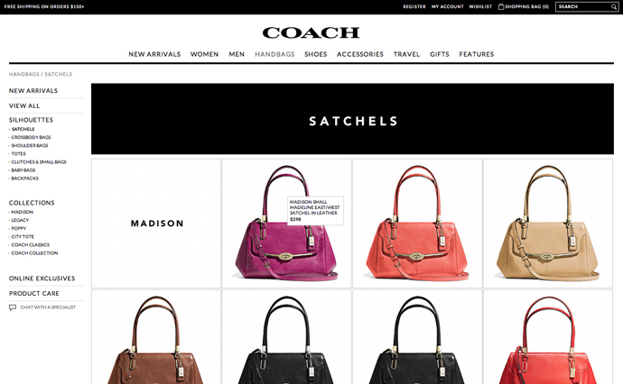
Why it works:
Coach does a great job on their landing pages by using great photography together with simplicity. The user can move through the sections easily with the sub-navigation to the left, but the images are kept larger so the user is engaged in the products. The content is kept to a minimum until the user clicks through to know more.
2. Bellhelmets.com
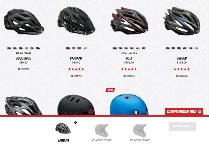
Why it works:
Even though there is more information on Bell’s landing pages than on Coach’s landing pages, the design of elements has a clear hierarchy and the spacing around them kept larger. The page doesn’t feel cluttered because of the specific visual treatment of each element. They also do a great job of adding in additional functionality that allows the user to compare three products together. The entire experience is very usable.
Strategic Product Detail Pages
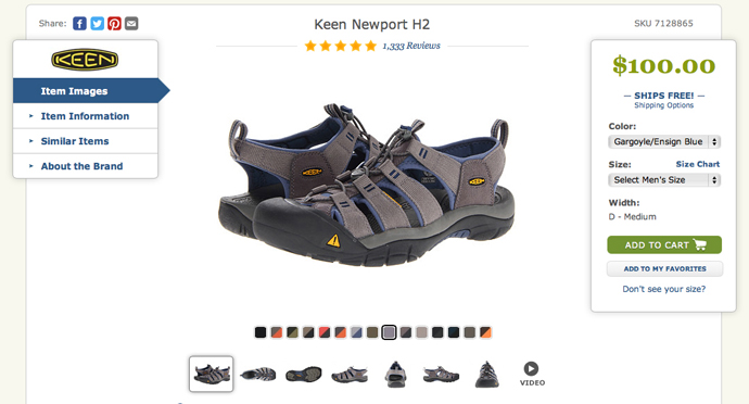
The first the page the user sees is the landing page, which gets them excited about your overall product line. The next page they should go to is the detail page of a product they are interested in. There is more functionality on this page that needs to be created with care and house a specific strategy. Depending on the amount of content you have just remember hierarchy of information is key here. Always make the add to cart easily visible and accessible on this page.
Zappos.com
Why it works:
Zappos has quite a lot of information and they keep a really clear hierarchy. Information is grouped together to improve the simplicity of the pages but allow the user to get the information quickly and easily. The hierarchy of elements create visual cues to draw the user’s eye to add the item to their cart.
Overall Design Harmony
When designing for e-commerce the most important factors for a successful user experience are simplicity, consistency and a sound hierarchy. Each element has to have a purpose and create a visual hierarchy for the user’s eye to move through the content.


