The 6 Web Design Trends That Convert
Websites that win put a focus on sales and converting the visitor. Websites are a critical part of the sales and marketing processes by providing functional features to the visitors that keep them engaged. Visitors don’t want any more noise so the design trends have slanted to a simpler and cleaner look which has resulted in quickly providing the visitor relevant information.
When you design your next website consider these 6 simple design features.
1. Flat Design
Windows 8 introduced flat design to us and Apple followed suit when it launched iOS7. User interfaces are simpler and web designers have removed the clutter and extra design elements that were once popular.
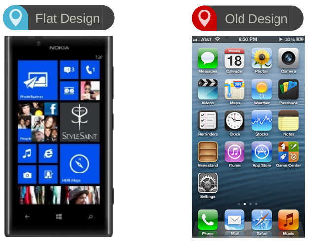
Check out 11 Beautiful Flat Site Designs
2. Give Your “Pitch” with Scrolling
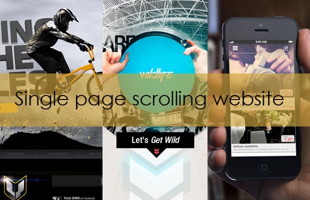
It wasn’t too long ago when the term “above the fold” was a commonly used buzz word in design meetings. The goal then was to prevent scrolling on websites. Around 2012 the scrolling became popular and has resulted in simpler websites that quickly convert visitors. Why? Because when done correctly the website is able to send the visitor down a journey which you have controled, thus giving your sales pitch.
Check out A guide to single page scrolling websites
3. Less Text
People typically skim websites and read very little so give them exactly what they need. This is where good content writers shine because its a challenge to write more effecitvely with less sentences. But the less content the better you’ll have your reader’s attention.
4. Simplify the Navigation
The original driver of websites with less navigation was mobile. But we have noticed that it is effective across all devices now. Just like scrolling, a simple navigation sends users exactly where you need and want them to go.
OK, Here are Two More That are Not So Simple
5. Better Images
Generic stock photos won’t work anymore. Large, rich and relevant images that quickly tell the story are the most effective. Think of Twitter and their recent update with allowing images to show up on Twitter feeds. Tweets with images obtain more engagement then those without images. Instead of the extra design details put into the website, web designers need to spend more time on designing the effects of the image as well as placing custom fonts on them that will tell the story.
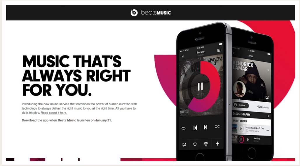 Check out Make Better Websites
6. Video and Moving Backgrounds
This is a feature that we don’t see much of yet but I have a hunch we will see more video and moving backgrounds. These seem to be effective in engaging the user and providing them with a memorable experience. This may not sound simple but the technology is there to develop these. Now might be a good time to look into this as something that will truly set your website apart.
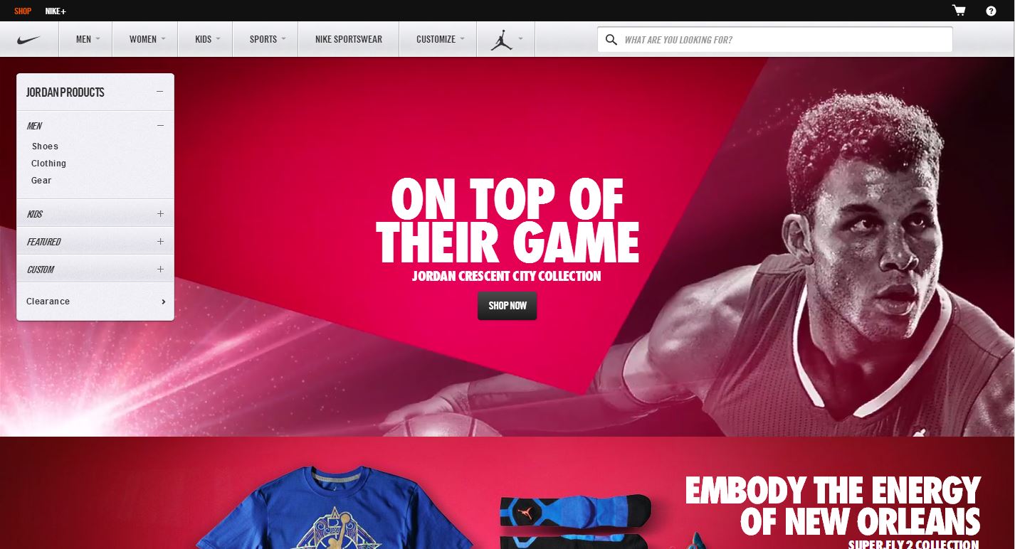
Check out Example Websites with Video and Moving Backgrounds
Do you agree or disagree with these six simple design features? Are there any we missed that need to be added to this list?

