Giving Our All for Giving USA
Project Overview
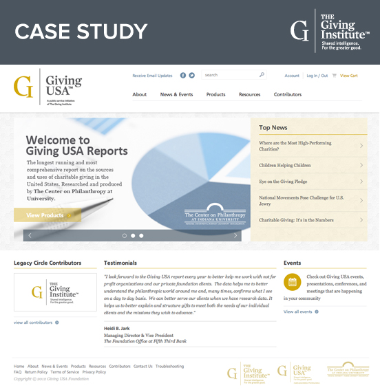
Giving USA: The Annual Report on Philanthropy (Giving USA) provides the most formative reporting on sources and uses of macroeconomic charitable giving in the United States. They pride themselves on adhering to the most meticulous methods available for estimating total charitable giving in the United States every year. The release of their efforts is a collaboration between Giving USA Foundation, The Giving Institute, and The Center on Philanthropy at Indiana University. Every year, Giving USA produces executive summaries, presentation materials, data graphs and a large annual report to compile these findings and share them with the public.
With this awesome collaboration, Galvin was hired to re-design and re-strategize their website as a hub for which to educate the community and distribute these periodicals. The project was large in scale and had a very tight 3-month timeline. It required our project management, user-experience design (UX), e-commerce and development teams to come together and work on a project that had extremely involved requirements:
1. Discovery & CXM
2. E-Commerce
3. Salesforce integration
4. Digital Rights Management (DRM) Software
5. Custom Payment Gateway
6. Content Management System (CMS)
Discovery & CXM
Giving USA’s sales were plunging and their website was not being utilized. They couldn’t keep it updated and users couldn’t find what they needed. We utilized our Customer Experience Management (CXM) model to first prioritize these goals and pinpoint their audience. We documented the primary and secondary goals as follows:
1. Establish Giving USA as a free source for charitable giving information.
2. Thought Leadership & Education
3. Customer Signup for free resources.
4. Product Sales
We then generated specific actions the users were going to take to carry out these goals in the most efficient way possible. Therefore, we could keep the UX user-centered as well as meet the client’s objectives.
New Customers Through Thought Leadership
Giving USA is able to give hours of research and pages of data free to customers by way of their Executive Summary. This one offering is invariably important for the client because it gives their customers free information but also drives sales to their Annual Report. Our strategy was to make sure this summary was easy to find because it accomplished all four goals at once. By creating a site that focused on the main content the user was there to acquire, we could manipulate the user flow from resources to online store and help generate sales.
Product Sales & Salesforce Integration
The integration with Salesforce would prove to be an important piece for lead generation and delivering the Executive Summary on the web. We set up the integration through a web form where the customer would have to give their contact information before they could download the summary. New leads were then formed for future interactions. Thus, Salesforce gave us a way to not only obtain new customers but retain them as well.
The UX & Design
Giving USA Foundation was going through a rebrand at the beginning of the project. We worked closely with their branding firm to design a site for Giving USA that paid respect to the brand but also stood out on its own from the Foundation. The color palette, typefaces, voice and tone were kept intact, but we added some details with texture and pattern that would keep the sites separate from one another.
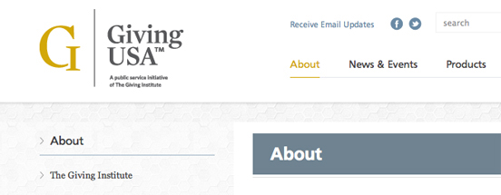
Apart from the aesthetics, we used specific front-end technologies to create a better user-experience. With JavaScript, we kept the header that houses the principle functionality (main navigation, search, account login and shopping cart) on the screen at all times, so when the user scrolls down the page they can still use these functions. This UX decision not only had the user in-mind but also the client. With the Cart and Product Page links always in-view, it would always be very easy for the user to make a purchase. Overall, the user-interface held specific types of content to address the client’s top goals of thought leadership and lead generation.
Combining Technologies
To combine our strategy and UX efforts, we developed a robust backend that combined a plethora of different software. The integration of Galvin’s CMS, Salesforce, Able Commerce and IUPayPlus (IUPUI’s own payment gateway) would prove to be a rigorous task. When working with so many third-party systems, each one has its own quirks and must be thoroughly tested. All systems were tested by our development team as well as IUPUI’s IT department, which turned out to be a great collaborative experience. We also used Digital Rights Management software to help stop any copying of documents without purchase.
A Successful Launch
We successfully launched “Giving USA: The Annual Report on Philanthropy” marketing and e-commerce website within our given timeline. When working with so many different products that have to be seamlessly integrated, the project can become quite complicated and many challenges can arise. Our teams were able to pull together when adversity arose and develop a very powerful and functional website.

